Text Field#
The Text Field widget provides a box for editable plain text. Unicode, multiline, cursor navigation, selection and clipboard features are supported.
Properties#
Unique properties of the Text Field
Widget#
Adjust these properties to customize the opacity of the widget
Properties
- Controls the opacity of the widget
Floating Point variable, defaults to 1.0
- Controls the rotation of the widget
Floating point variable, defaults to 0.0min:0.0max:360.0
Layout#
Adjust these properties to customize the dimensions of the Text Field relative to the screen
Properties
- Controls if the widget should stretch to fill the available space or not
Boolean variable, defaults to False
Text#
Adjust the text properties
Properties
- Controls the text displayed on the widget
String variable, defaults to an empty string
- Hint the text of the widget
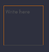
String variable, defaults to "Write here"
- If True, the widget will be able show multiple lines of text. If False, the “enter” keypress will defocus the textinput instead of adding a new line
Boolean variable, defaults to False
- Font size of the text in pixels
Floating Point variable, defaults to 15.0
- Whether the tab key should move focus to the next widget or if it should enter a tab in the TextInput. If True a tab will be written, otherwise, focus will move to the next widget.
Boolean variable, defaults to False
- Controls the color of the text
- Controls the color of the selected text
Password#
If True, the widget will display its characters as the character set in password
Properties
- Set a Password
- Choose to have a Password
Boolean variable, defaults to False
Background#
Adjust these properties to customize the color of the background
Properties
- Controls the background color of the text field
Underline Style#
Adjust the underline color of the text field
Properties
- Adjust the underline color of the text field while unfocused
- Adjust the underline color of the text field while focused